goodr – scalable ux solutions & testing for e-commerce
When I first arrived at goodr I found a site in desperate need of UX optimization. The site had a meandering user experience which lacked solid direction and clarity. Many of the modules were sprawling and outdated and navigation was a chore (something validated by A/B tests, user surveys, and user journey maps).
A prime example of the work I do at goodr surrounds the PDPs – a critical node in the customer journey.
fig 1. PDP as it was when I first arrived at goodr
If goodr is good at one thing it’s content. We produce images in house via our production team but the images were often being skipped over and fought with one another for attention as users refused to scroll down below the fold. This data came from heatmaps powered by Hotjar.
fig 2. Redesigned PDPs with carousel & variants.
To solve this I implemented a new image module which supplied users with satisfying feedback as they browsed images and brought content and the point of focus back up above the fold. Another change I identified and executed was the addition of variants to the PDPs. As I said, we had identified a pain point for our users – the navigation experience. We had many varieties of SKUs for the same model of glasses but to view them all was an arduous process of navigating back and forward between collection pages and PDPs.
I brought this experience under one roof housing navigation for a single model all in one place. I also adjusted page headers to communicate the idea of the SKUs belonging to a single collection. The theory was that by adding variants the users would have an easier time locating products of interest and conversion would increase as a byproduct of easing the product discovery process. A/B testing via Omniconvert validated this hypothesis as true, with a 2% increase in conversion after implementation likely due to an easier product discovery process. I led, monitored, and implemented this project from Design to A/B test with support from our in-house Developer.
In a tracking overlay the users would see the names of the sunnies they were previewing pop up under their mouse. Our copy team is hard at work coming up with ridiculous titles for the sunnies – something our company is very proud of. I took action to highlight these names to drum up interest in the product and highlight our irreverent and fun naming scheme. This helped to create a more impactful brand story. Part of UX work is the consideration of brand accessibility. User experiences can educate and ingratiate users to brands – creating loyalty – through fun or charming interactions.
fig. 3 the new desktop product cards and filter after my redesign.
fig. 4 the new mobile product cards and filter after my redesign.
Another project I’ve taken on is the redesign of product cards and a new filter design for collection pages on .com. The problem: how do we design a less obtrusive filter menu (especially on mobile) and upgrade the aesthetics and navigability of our product?.
The solution: change the filter to no longer be an overlay on mobile, add variants to the product cards, and do market research into contemporary trends in the e-commerce space. I went on to journey map and iterate multiple prototypes for this solution, settling eventualy on the design you see above.
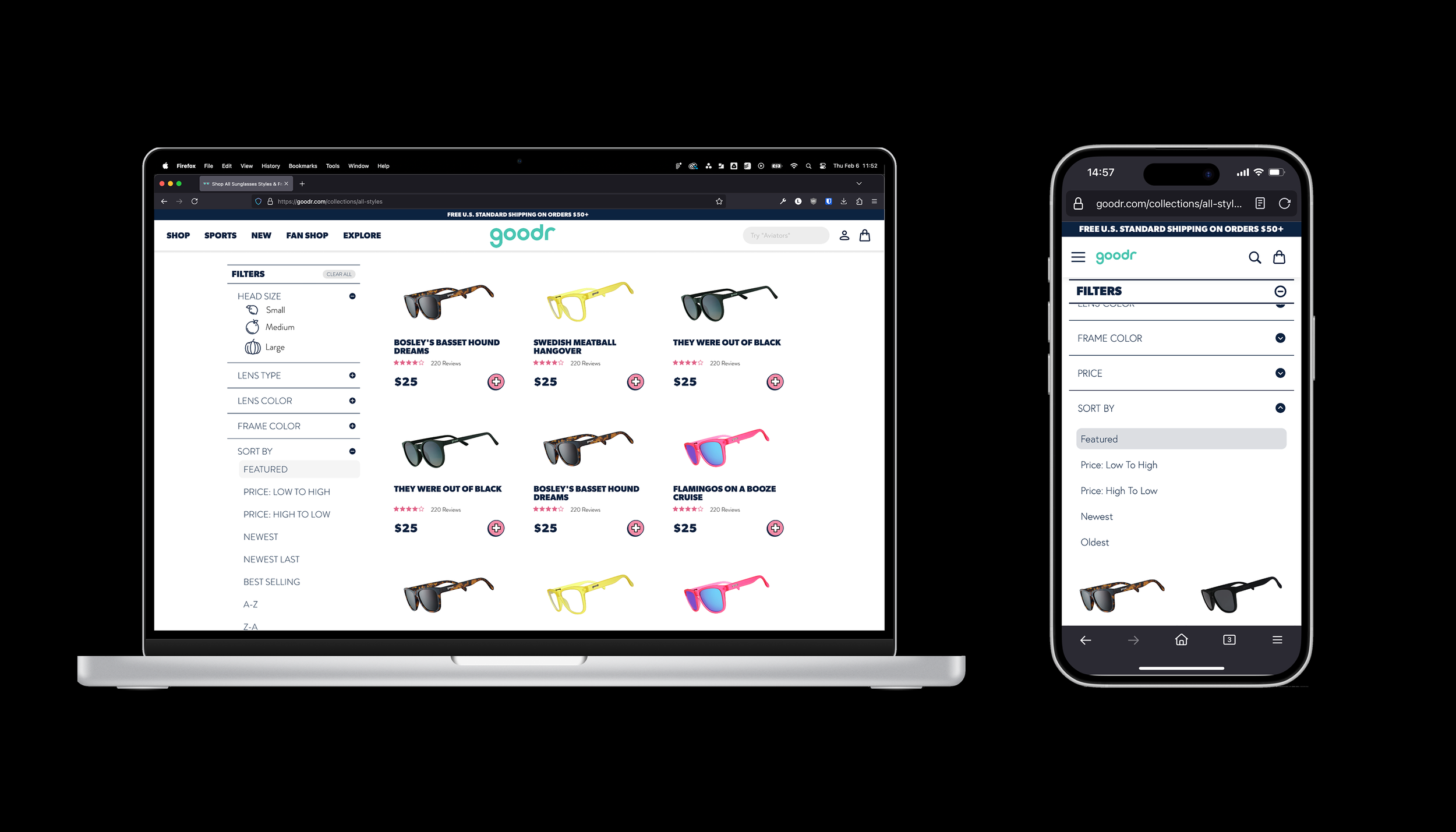
fig. 5 The collection pages on mobile and desktop before my redesign
Above is where we started. The design was much more cluttered and inaccessible. I worked to clean up this look and feel while providing better access to filter options. The product imagery was not given the light they deserve and the look cheapened the product offering.
fig 6. Mobile search Figma prototype with suggestions.
My work extends beyond PDPs and collections however, and covers the entirety of goodr.com. As the founding UX/UI Designer at goodr I lead projects and identified possible conversion bottlenecks via research. One of the spots needing improvement was an underutilized search functionality. Through research we identified that users who use search are much more likely to follow through and convert. I redesigned the search functionality to be more user friendly and provide recommendations for searches as the user types. This reduced friction and led to a more pleasant experience overall. The introduction of product recs via search was also added to desktop.
The original design (not shown here) was a basic search bar which did nothing for users besides let them shoot in the dark. Product discovery is a struggle at goodr as our offerings are vast, and by optimizing the search functionality we were able to reduce friction and create a stickier, more engaging, product discovery process.
fig 7. the review module when I first arrived at goodr
goodr has an amazing wealth of reviews – a data set I identified as being underutilized. As it stood when I first arrived the user would see a preview of three reviews with no further filtering and little context. The user could then scroll, three reviews at a time, through the entire body of reviews available to the user – an action which was highly impractical given the tens of thousands of reviews on site.
fig 8. Prototype of the new review module made in Figma
I reforged the reviews to be navigable and informative. Modules which previously did not expand where given light-boxes. Media which would get lost under piles of 5 word reviews was made accessible through media filter options and a media view module which would allow users to view customer images. These changes were planned for after I drew up a user journey map which identified pain points and opportunities for the module. These changes were also reflected on mobile (not shown here) as the design requirements for all of my e-commerce work has to be dynamic and responsive.
The experience was given new life – users could now see the reviews and content they needed to see to boost their confidence in the brand.
As an accessibility minded UX designer I find it critical to stick to guidelines set out by institutions like WebAIM. It is critical that the web be accessible to all. As dependence on websites increases throughout culture it is the duty of UX designers to ensure experiences are not denied any party on account of physical or mental differences. In light of this I try to design with accessible fonts and font sizes, and I make sure to check contrast whenever new color combos are introduced. Accessibility extends beyond the obvious however, and I believe clear groupings and low cognitive loads provide access to many neurodivergent groups.