Strong Baby Productions – Web platform
Deployed Strong Baby Productions web platform
As a part of my contracted work with Dolphin.Limited I joined the team creating, and spearheading the design of, Jonah Hill’s Strong Baby Productions web platform.
Strong Baby Productions is a production studio based out of Los Angeles that creates films with Netflix (You People, Stutz) and continues to develop new films currently. The web platform serves as a hub for media and news about past and upcoming films, as well as an outlet and host for a shopping experience offering a line of street wear products being released under the production studio’s name through monthly releases (or drops) of exclusive clothing items.
The main challenge of this project was to design a platform that can provide both information about the ongoing / past work, and history of Strong Baby productions, while also successfully facilitating a unique and stylish street wear shopping experience.
Our client wanted to emphasize the shopping experience and build the brand of Strong Baby as something cool and stylish. This was Jonah’s vision for the company – he decided to include the street wear drops as something attached to the production studio itself as a way to establish its unique identity.
With a small team working the project, I lead design, and worked together with the developers, a project lead, and another designer to create the final product through a cross team collaboration method.
Fig. 1 User Journey Map for user persona Monica
We started off with a User Journey Map to immediately identify overarching experiences we’d need to facilitate. We also used the opportunity to hone in on more minute features and potential pain points which we would work with later on in the design process. We identified categories of features that we’d need to develop, and possible opportunities for the implementation of new approaches.
I revisited the User Journey Map later on when creating the User Flow and Figma mockups of the Strong Baby web platform, in order to keep a clear and steady perspective on the challenges I was designing for.
Fig. 2 Strong Baby User Flow Map demonstrating research and a successful sale via the web platform
By laying out a constellation of pages and actions we opened up discussions regarding the flow and feel of our platform, hypothesized and shaped user interactions, and visualized clearly what exactly it was we were designing.
This was critical to our decisions surrounding the homepage.
We addressed the main challenge of our platform here – that being its dual nature as a news media outlet and a shopping experience – by centering the experience on the user and directly providing them a visual launching pad from which they would decide what kind of content they wished to explore more of.
This way the street wear aspect of the brand, which the clients wanted to emphasize, did not recede to the background of the platform’s design as often happens with merch on company sites. The products could contended directly with and healthily compliment the news content users saw, effectively creating the multimodal world of Strong Baby on our platform. News regarding the film productions of Strong Baby needed to take slightly more precedence over the merchandise, but merchandise needed to have a strong emphasis throughout our platform.
Fig. 3 Component Map
We also talked over each and every one of the necessary components of the front-end of the web platform. This was especially helpful to the developers who we worked with, who could refer to this as they coded. It also provided an accurate scale for the quantity of individuals blocks developers had to code.
As a designer I could refer to this map while working on individual pages and ensure there were no oversights on my part during prototyping.
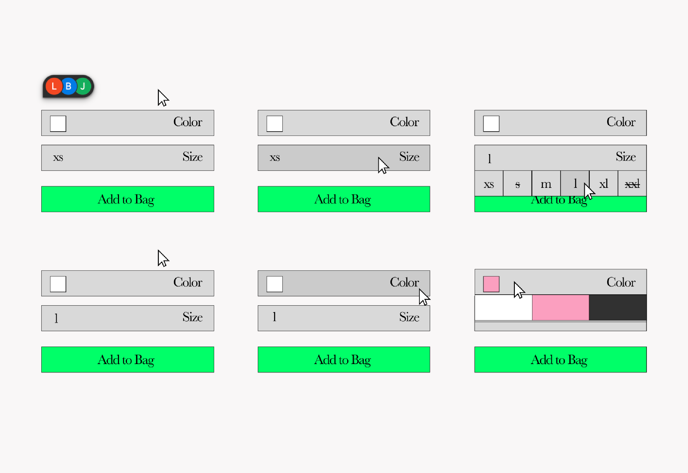
Fig. 4 Color and sizing touch point illustrations
When it came to product customization touch points we took advantage of the CSS flexbox feature, and I designed a size and color select which was meant to both feel quantitative and fun in parallel to the sharp contemporary and paired down aesthetics of the platform.
Here is an example of the manifestation of an opportunity jotted at the bottom of the original User Journey Map. This custom touch point was made to push the artistic styling of the artful and unique platform, which showcased films in production, and offered fashionable accessories.
The entire world of Strong Baby required an artful and unique approach to connect back to the core values of the production studio.
So often everyday features get overlooked and so too does the opportunity for new approaches which bring a little more joy to the user’s experience.
Fig. 5 Figma prototype of the Strong Baby productions web platform on iPhone.
As the team was small and the project on a quick turn around, we did not have time to develop thorough rounds of mockups and were pressured to go directly to a HiFi design without as much breathing room as I would have liked. I hope during future projects I have the space to delve deeper into mockup stages. I find it lovely to talk over flows with other designers while working directly with developers as to nip troublesome and problematic layouts in the bud.
You can visit the live site at https://www.strongbaby.com/
